Monday, 27 July 2020

The new NPS-UD

The new National Policy Statement on Urban Development (NPS-UD) is out.
Image result for 6 storey building - paris

A quick read through prompts a few thoughts.

What happened to quality intensification?

The policy actively supports (enables) intensification close to main centres and rapid transit routes, which is a big step from the previous statement which was kind of agnostic about whether urban areas should go up or out. But what happened to quality intensification? 

I can't find a mention of quality urban design. I guess plans can still address this. At least the NPS-UD doesn’t require bad design, but it would have been helpful to have a reference to quality urban design. 

Whereabouts?

Policy 3 ( c ) is the interesting policy. This requires that plans 'enable': 

building heights of least 6 storeys within at least a walkable catchment of the following: 
(i) existing and planned rapid transit stops 
(ii) the edge of city centre zones 
(iii) the edge of metropolitan centre zones.

The references to rapid transit are all a bit loose and no doubt we will  spend hours debating what a walkable catchment means (it would have been good if they specified a distance or a walking time);  what is 'planned' (how far in the future can we look) and what is a permanent route (road or rail) that is largely separated from other traffic (is a green painted bus lane that operates between 4 and 6pm sufficient?).

What does 'enable' mean:

Not much detail on what is meant by 'enable'. Enable a lot or not much? No mention of what activity status should be used (is a restricted discretionary status enabling? - depends on the extent of the discretion I guess). Does enable mean permitted or controlled? 

Subpart 6 – Intensification in tier 1 urban environments - says every tier 1 territorial authority must identify, by location, the building heights and densities required by Policy 3. 

Does the reference to building heights of at least 6 storeys imply some sort of minimum height? Is a two storey terrace house OK in the area to be identified for 6 storeys (or is that a waste of a scarce resource?). 

And when a consent is lodged, I'm  struggling to work out what the following means: 

Nothing in Policies 3 or 4 or this subpart precludes the consideration (under section 104 of the Act) of any actual or potential effects on the environment associated with building heights. 


Unresolved trade offs. 

The NPS's requirement to enable intensification close to city centres is likely to set up a big battle in inner suburbs between the 'intensifiers' and the 'retentionists' - those that wish to develop to 6 storeys or those who wish to retain special character areas. 

The policy allows for councils to opt out of the mandatory 6 storeys if one of a number of  'qualifiers' is present. These qualifiers include section 6 RMA matters (like heritage) but not section 7 matters like special character.  

There is a back door for special character to come into play - one of the policies allows for consideration of specific characteristic that makes the level of development directed by Policy 3 inappropriate in an area,  but the reduction has to be justified as to why that is inappropriate in light of the national significance of urban development and the objectives of this National Policy Statement; and include  site-specific analysis.  No mean task. 

The missing middle ring:

The shame of the policy is that it has stopped at the first 'ring' out from the centre, it didn’t go the next step and say what should happen in the 'middle' ring suburbs (apart from where a rapid transit line intersects these suburbs). Auckland has demonstrated the power of the removal of density controls in the middle ring. This is likely to be a much more powerful approach to intensification than what is proposed by the NPS (and more likely to be market driven).  So maybe the NPS could have simply said: 'ditch the density control and the minimum parking requirement".  But again, good urban design is vital. 


Infrastructure: who pays?

Policy 3.5 (availability of additional infrastructure) says that local authorities must be satisfied that the additional infrastructure to service the development capacity is likely to be available. 

It is not clear if that policy could be used to slow or stop the implementation of the intensification policy. If wastewater and stormwater systems are not up to scratch (like the western Isthmus in Auckland) or there is not enough open space in the areas where 6 storeys must be enabled, are these matters sufficient reason not to enable intensification? 

Who pays for the upgrades? Some new ratepayers in the area will help spread costs, but it will not be enough to cover all the costs. Should suburban residents subsidise the needed renovation and expansion of social and physical infrastructure required? This 6 storey development will not be in poor areas, they will be built for wealthy households (unless the units built are very small). 

Mixed messages over greenfields 

The cost / benefit analysis that accompanies the policy statement is actually quite helpful when it comes to greenfields, noting that benefits for housing affordability can be quickly lost due to a range of costs. 

This subtlety, however, seems to have got lost in the actual policy. 

There is reference to the benefits of out-of-sequence development. 

At the same time there is the need for certainty over infrastructure provision and while I may be reading things wrong, the implication seems to be Councils have to line up all the funding? 

What happens if the critical infrastructure is government delivered (eg motorway extensions or new rail lines?), or where the user should pay?  

What to do about climate change? 

The opportunity has been taken to add a bit in about climate change. 

Objective 8 says New Zealand’s urban environments should support reductions in greenhouse gas emissions; and be  resilient to the current and future effects of climate change.

Sounds good. The policy to implement this objective:

Policy 1: Planning decisions contribute to well-functioning urban environments, which are urban environments that, as a minimum:

support reductions in greenhouse gas emissions; and 

are resilient to the likely current and future effects of climate change.

So the objective and the policy are the same, which is not very helpful. This smacks of a quick add-on at the end of the process. This is a shame, given how important climate mitigation and adaptation are to urban areas. 


The importance (or not) of lots of capacity

As with the previous NPS, the focus of the statement is really on capacity for housing. It is not a holistic or integrated statement about urban development.

The focus on capacity is understandable, but perhaps it's hoped for benefits are over stated? 

Nowhere is there an acknowledgement of capacity already provided by plans. The NPS cost/benefit study, for example, seems to have a blank spot when it comes to the moves already made in Auckland to increase capacity. I guess the capacity is in the wrong spot. Capacity has always increased overtime. That’s the purpose of plan reviews and consents. Granted, past reviews haven’t been bold enough; perhaps the planners have been bold, but not the politics. 


The focus on capacity that is feasible and that is likely to be taken up tends to narrow long term urban development options, not open them up. Does the housing capacity to be provided in response to Policy 3 count as feasible and likely capacity (even through 6 stories is probably not feasible or likely in many places?). 


Sitting behind the NPS is a great deal of interest in the elasticity of supply of housing. House prices have gone up a lot (well land prices have), but housing production has apparently been sluggish. If only more houses were built, prices may stabilise. Why is supply more inelastic than in the past? There must be a constraint, goes the standard response. But is it that simple. Housing supply has become more inelastic over time. Is that because of boom and bust migration and economic patterns making 'over' supply more risky than in the past; the rise of housing as an asset meaning demand is set by the performace of other asset classes, not population growth; or is it the reduction in the number of traditional builders building a single speck house and the rise of various barriers to entry for new players into the housing development market, especially if more houses are going to be in 'groups' like terraces and apartments ? 

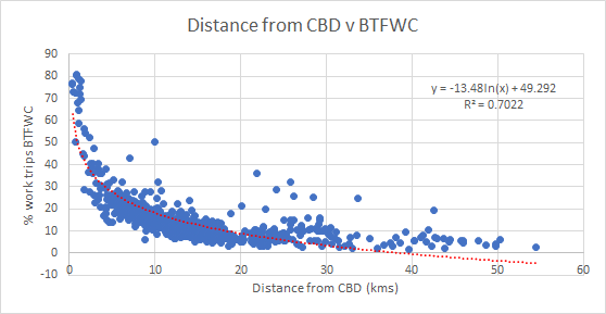
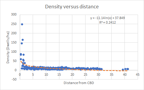
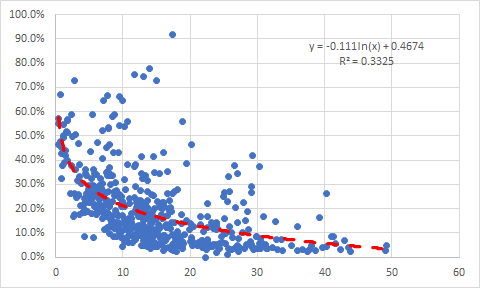
Finally, and I think importantly, there is a bit of a density paradox at play in most NZ cities. The wealthy like to live close to the centre, not further out. This is different from most American cities which tend to have low income inner cores and wealthy suburban outer rings. Inner city areas should be densely developed to provide cheap housing options. But wealthy households can consume quite a bit of land and floorspace, as well as benefit more than others from quicker commutes, so they look for good amenities, good proximity and substantial amounts of open space, and are happy to pay high prices for these attributes. In most NZ cities,  inner city suburbs are favoured spots for a range of households than can bid high for these properties, and once in, they don’t want too much to change. 

Our inner suburbs stopped developing at the two to three storey stage, they didnt revelop into the six storeys of Europe (which has a longer set of urban redevelopment waves). I don’t think an NPS is going to make that picture much different. Yes there will be some patches that can and should redevelop, but to make it all work, there is going to be quite a bit of shifting around of people and activities. What needs to be freed up first is the places that activities and households that get displaced (or which need to be displaced) can relocate to.  That is the real planning task. 


Thursday, 18 June 2020

Urban Design and the RMA: Urban Planning v Urban Design

Further thoughts on urban design under the RMA.

It is important to distinguish urban design effects from other effects. Otherwise there may be double counting. For example, there is a big overlap between urban planning and urban design. Are urban design effects just urban amenity effects? There is also overlap with landscape and visual assessment, In this blog, I want to look at urban planning and urban design. 

There are different ways to conceptualize this overlap:

Urban design has been described as second order design. First order is buildings or spaces. Third order is (spatial) planning. Urban design is said to be the link in between these two orders, finding first order designs that help fill in the third order outcomes. Some urban designers will baulk at this distinction, as urban design works across all spatial scales.

Another way to look at the issue is that urban design follows a different process to urban planning. Urban planning follows a structured process of identifying outcomes, options analysis, making trade offs and selection of appropriate set of tools to achieve the desired outcome.  Urban planning attempts to be rationale. It is by its nature synoptic (it tends towards the large scale). The end product tends to be a bunch of processes and procedures against which individual developments are judged.

Urban design in contrast could be said to be more place-based and more iterative in its approach to bringing together a range of outcomes for an area or site.   The design process can be a bit irrational and improvised. There may be no universal sequence of stages – analysis, design and implementation are contemporary and inextricably linked. The end product can be a resolved 'plan' for an area - the masterplan or structure plan.

This process type distinction may be valid, but it doesn't really help with distinguishing urban planning from urban design effects. The idea that urban design may operate at a different 'level' to that of urban planning is more useful. But how to describe this in terms of RMA effects?

To  start with, urban design can be said to concentrate on the quality and functionality of the built environment. It is clearly not about management of the natural environment, or about infrastructure planning, for example, although these matters are relevant matters. Urban planning could be said to sit above and span across these different 'inputs'.  Moving on from that, clearly urban planning has a focus on urban quality, but is perhaps more directed at the basic building blocks of urban quality, rather than place-based responses. 

Urban design brings in a strong element of the human response to new and modified urban environments. Perhaps this is the strongest distinction between urban planning and urban design - urban planning needs to take a long term (intergenerational) view of the management of urban resources; urban design is more about the day-to-day response and interplay between people and the built environment.   

Matthew Carmona has suggested in Place Value: Place Quality and its Impact on Health, Social, Economic and Environmental Outcomes (see note 1) that it is possible to envision different urban qualities as sitting on a ladder that climbs from:
  1. those place qualities to be avoided when shaping the built environment (because of their very possible negative impact on place value); 
  2. those place qualities which are fundamental and which should be required as a means to maximize place value through good design.
  3. place qualities that are strongly associated with the delivery of place derived value of all types (and which should be the aspiration of built environment policy and development-related decision making). 
I think the list of things to avoid and those that are essential (number 1 and 2 in the list above) are more to do with urban planning, rather than urban design.

Starting with the qualities that are fundamental:
  • greenness in the built the environment (notably the presence of trees and grass, water, and open space ‒ the latter if of good quality); 
  • a mix of uses (notably the diversity of land uses within a neighbourhood); 
  • low levels of traffic; 
  • the walkability and bikeability of places (derived from their strategic street-based connectivity and the quality of the local public realm); 
  • the use of more compact (less sprawling and fragmented) patterns of development; and 
  • ready convenient connection to a good public transport network. 

And the qualities to be "avoided":
  • car dependent and extensive forms of suburbanization;
  • relentlessly hard urban space (absence of local green space);
  • too much very local permeability;
  • the presence of rear parking courts and other segregated areas;
  • poor maintenance / dilapidation (including of green spaces);
  • a sense of overcrowding in residential areas;
  • the presence of unfavourable food stores; and
  • the impact of roads with higher traffic loads and speeds, wider carriageway widths, or which are elevated.
Im not quite sure what unfavourable food stores are (too may fast food outlets?)  while some of the effects are more operational rather than layout and design (such as poor maintenance).

Urban design can then come more strongly into play in the third sets of qualities, as described as follows:

Next there is a strong positive association between place derived value of all types and fifteen often less tangible, sometimes subjective, and generally more difficult to measure qualities of place. Whilst the evidence on each of these remains powerful, it is not definitive, in the same way as it is for the qualities already discussed. Partly this seems to be because the more ‘difficult’ nature of these qualities makes researching them more challenging, and so there is often less research available on which to make a definitive assessment. There are also greater challenges in specifying exactly what quality means in these areas, making the evidence that is available more equivocal.

These qualities include:
  • visual permeability;
  • sense of place (distinctiveness);
  • pedestrian scale (of streets and buildings);
  • façade continuity;
  • natural surveillance (the creation of defensible space);
  • presence of street level activity / background movement;
  • good street lighting;
  • a denser street network (urban grain);
  • low traffic speeds;
  • low neighbourhood noise;
  • presence of attractive / welcoming / comfortable / adaptable public spaces;
  • positive (sociable) public/private threshold features;
  • integration of built heritage;
  • integration of natural features and a diverse ecosystem; and
  • perceived architectural quality and beauty generally in the built environment.
Carmona notes that whilst some of these qualities, for example façade continuity or traffic speeds, are relatively easily specified, most need more careful interpretation. In his words, they are therefore likely to be ‘aspirational’ rather than required qualities. In RMA terms they may be qualities that need assessment as to the degree to which, if they are missing or only partially applied in a development, adverse  'spillover' effects may arise.  

Interestingly, he has a set of qualities that are not so certain as to the link to place quality. These are:
  • different architectural styles (about which the evidence is simply unclear).
  • higher versus lower densities of development (where within the health research, and with regard to sociability versus perceived crime, the evidence conflicts).
  • extreme densities (where conflicting evidence is apparent relating to carbon reduction, social welfare and ecological richness).
  • high-rise living (where the evidence is unclear, although tending to warn against families living in such circumstances).
  • street length and pedestrian connectivity (where divergences are apparent within the evidence on health versus crime).
  • cul-de-sacs (where, within the evidence on crime and safety and with regard to property value, sociability and children’s play, conflicts are apparent).
  • vehicle / pedestrian separation (about which the evidence is weak and indecisive).
  • use of shared spaces (where conflicts are apparent, particularly with regard to the evidence on actual and perceived safety).
  • the economic impact of the proximity of retail to residential properties (about which conflicts exist on the relative size and impact of negative externalities sometimes associated with local retail)
Some of these qualities are relevant to urban design principles. I guess what is important is that these sets of qualities need to be applied with a high degree of judgement. 


Note 1: Place value: place quality and its impact on health, social, economic and environmental outcomes. Matthew Carmona. Sourced from  https://www.tandfonline.com/doi/full/10.1080/13574809.2018.1472523


Thursday, 4 June 2020

Journey to work and housing density


In  theory, there should be a relationship between transport accessibility and urban form. As transport costs increase, cities tend to build up; as transport costs fall, cities tend to spread out. As cities get more densely developed, then high capacity public transport becomes more important in getting people around.

What about Auckland?

Starting with transport, if I plot distance from the CBD (as the crow flies) versus the percentage of bus, train, ferry, walk and cycle trips to work (in 2018) based on home residence, then I get the following graph.

This looks quite a good relationship: as distance from the central area increases, then the number of bus, train, ferry, walk and cycle (BTFWC) trips to work decrease. This data is based on census area units and 2018 census data.


Using the formula provided by Excel, I get the following broad pattern.


Distance (kms) from centre
5
10
15
20
% work trips by BTFWC
27.60
18.25
12.79
8.91

Now lets look at housing density. The following graph plots gross dwelling density (again by Area Unit) by distance from CBD.


The dwelling density figure is a ‘gross’ figure - the land area of the Area Unit divided by the number of dwellings. A low gross density may therefore be because of a large park being present in the Area Unit, not because housing is spread out.

Again, based on the graph, I get the following broad pattern.


Distance (kms) from Centre
5
10
15
20
Dwelling density (dwell/na) 
19.5
11.6
7.0
3.7


There is not necessarily a one to one relationship between the two sets of figures (journey to work and density) but the curves are not dissimilar.

Going from a dwelling density of 11 dwellings per ha to 20 dwellings per hectare will not automatically mean that public transport, walking and cycling will go from  18 to 27% of work trips, as proximity to the centre cleary has a big influence on both density and use of public transport, walking and cycling.

If we look at urban form, rather than density, then the percentage of dwellings that are in an attached form (rather than stand alone) should also increase as distance reduces (and public transport, walking and cycling increases).

The following graph plots the percentage of attached dwellings by Area Unit, based on distance from the centre.


Bit more of a scattered picture than for dwelling density.


Distance (kms) from Centre
5
10
15
20
% Attached
28.9%
21.2%
16.7%
13.5%


If we put the three sets of figures together then we get the following pattern:


Distance from CBD (kms)
5
10
15
20
% BTFWC
27.6%
18.2%
12.8 %
8.9%
dwelling density
19.5
11.6
7.0
3.7
% of dwellings attached
29%
21%
17%
13%

So as we go from 15 to 10kms out from the CBD, the % of BTFWC trips to work increases by 1.43, housing density goes up 1.66 and percent attached dwellings go up by 1.27. 


15-10 kms
20-15 kms
% BTFWC
1.43
1.44
Density
1.66
1.89
% attached
1.27
1.24

It would seem that the regional land use pattern is responding to transport costs and benefits. The question then becomes whether the observed step up in density and number of attached dwellings is responsive enough to the changed transport conditions. Should there be more , or less of a density step up? 


Saturday, 9 May 2020

Journey to work 2

More on 2018 journey to work patterns in Auckland. Last time I looked at journey to work patterns based on home location (or trip origin). Now its time to look at destinations (or workplace address).

But first, back to origins. If the percentage of work trips by bus, train, ferry, walking and cycling are mapped at the Area Unit level, then we get a 'concentric ring' type pattern, with the proportion of public and active work trips falling as distance increases from the centre.
There is a noticeable 'tail'  in Waitakere where (presumably) train use is quite high.

Now lets look at destinations (workplaces). Arranging Local Board areas roughly north to south, workplaces in the central Waitemata Local Board have a distinct peak of trips by public transport, walking and cycling, but otherwise the percentage of trips by bus, train, ferry, walking and cycling (or BTFWC for short) to other workplaces sees only a very gentle decline from the centre out to the edge. There is a bit of a drop off for the edge Local Boards of Rodney and Franklin. What is interesting is that the inner area Local Boards do not see a big step up from the middle ring Boards in terms of use of public transport and active modes to access workplaces, as was the case with origins.


If we look at bit closer at the Area Unit level, then, apart from the central area, there is no strong pattern of public and active transport use related to workplace locations.


When we look at where jobs growth occurred between 2013 and 2018, the central area is very important, but so too are the distinctive northern and southern employment hubs.


The growth of jobs in the central Waitemata Local board has had a big influence on rates of BTFWC. But what of the northern and southern sub regional hubs?

Overlaying the percentage of trips to workplaces by BTFWC with job growth does not suggest that the northern and southern employment hubs have made much of an impact on rates of BTFWC. Partly this may be because the workplaces in the northern and southern hubs are not concentrated in a few spots. These ‘hubs’ cover large areas, and are more of a cluster.


There is logic to the northern and southern hubs in terms of business location and proximity to many homes.

If we look at where bus and train use increased between 2006 and 2018 (differences between the 2006 and 2018 census questions for means of travel to work make it too hard to compare other combinations of trips), then the central area stands out, as well as Albany to the north and Manukau in the south, along Smales Farm, Ellerslie and Penrose in between.


So maybe locating more jobs along the central north-south spine of the region (northern bus way - central area - southern rail line) is the way to go. 


Wednesday, 15 April 2020

2018 census journey to work patterns for Auckland

The 2018 census journey to work data for Auckland provides some clues as to whether compact city is helping to support less vehicle use and greater reliance upon bus, train, ferry, walking and cycling (or BTFWC for short).

At the top level of the Region as a whole, in 2018 17.3% of people aged over 15 years who work, usually took the bus, train, ferry, walked or cycled as their main mode of travel to work This is up from 13.5% in 2006.

Looking at the 2018 data for BTFWC at the Local Board level, and arranging Local Boards (apart from Waitakere, Waiheke and Great Barrier Island) roughly north to south results in the pleasing ‘Mt Taranaki’ type profile set out in Figures 1 and 2.


Figure 1: % of work trips by bus, train, ferry, walking and cycling - 2018

As distance from the centre increases, then the proportion of work trips by BTFWC drops, with a similar pattern either side of the CBD.

If we look at the pattern over the period 2006 to 2018, then the central Waitemata Local Board area saw more of a lift in BTFWC trips than the outer Boards. See Figure 2.


Figure 2: % work trip by bus, train, ferry, walking and cycling 2006, 2013, 2018

The central Waitemata Local Board area has seen BTFWC climb from 38.8% of work trips in 2006 to 52.6% in 2018. At the other end of the Region, the Rodney Local Board area has gone from 6.1% to 5.6%, or a relative decline in other words (although this may because the census questions varied between the different censuses).

A Local Board area level of analysis is fairly coarse, and a more fine-grained level may help to highlight more specific trends, but at a strategic level, the Local Board level is not a bad place to start.  Also, the main means of travel to work variable is rated as moderate quality by Stats NZ and caution is advised when using this variable at small geographies.

So far, so good.

Now let’s look at where the new housing has located over the period 2013 to 2018.
The census records an increase of over 60,000 dwellings during the five years between 2013 and 2018.

If this data is arranged by Local Board area, again roughly north-to south, the we get a ‘triple peak’ outline, rather than the single peak of the BTFWC travel to work data.


Figure 3: Additional dwellings by Local Board 2013-2018

The northern outer suburbs saw a big increase, as did the central area, and the southern edge. The inner and middle suburbs took limited growth. If we match that picture up with the % of work trips by BTFWC, then the miss match is evident.


Figure 4: Mode of travel (2018  - right hand side) and new housing (2013 -2018- left hand side).

But of course, this miss-match makes sense. As distances from the centre increase, and transport costs rise (both private vehicle use and passenger transport services), then land and house prices should fall, making the edge more attractive for new housing.

It is tempting to look at the ‘gap’ either side of the central area and to speculate what would have been the transport outcomes if the region saw a more even pattern of housing growth between 2013 and 2018.  That is, new housing occurred roughly in-line with the share of dwellings in the Local Board areas, as of 2013. This could be called a 'fair share' approach to growth. Perhaps not a totally realistic approach, in that some Local Board areas may be less able to cope with growth than other areas (for example Local boards with extensive areas of heritage housing). Nevertheless, a fair share approach is a relevant policy approach.

If the new housing between 2013 and 2018 was allocated to each Local Board area based on the share of housing as of 2013, then we get the pattern in Figure 6.  The outer Local Board areas see less housing and the middle and inner Local Board areas see more. The central Waitemata Local Board area has less growth.


Figure 6: Additional dwellings 2013-2018, actual and reallocated.

The three peaks get flattened out, and the outline is more like a rolling landscape.

This is a very simplistic approach to reallocation, as household types vary between the different Local Board areas. Typically, the south sees larger number of people per dwelling, and so will have more trips per dwelling than smaller households on the North Shore, for example.

We can then compare the number of work trips generated by the reallocated ‘fair share’ pattern versus the actual pattern and see what difference that makes.

To do so, I first need to work out the number of work trips generated by each dwelling in each Local Board area; broken down into the number of BTFWC trips and the number of trips made by people in cars, on a per dwelling basis.


Figure 7: Work trips per 100 dwellings, 2018

Figure 7 shows the pattern. The Mt Taranaki profile of BTFWC trips is again apparent. Vehicle trips have a central “V” shaped valley profile. What is interesting is that vehicle trips rates are reasonably similar, across the Local Board areas, outside of the central area. The length of trips (kilometres travelled) may be greater, but the number of trips is similar. There is a bit of a rise in the south.

I can now compare the number of work-related vehicle trips and the number of BTFWC trips under the two scenarios: that is as per actual pattern of growth 2013 to 2018, and the re-allocated pattern. Table 1 sets out the estimate of trips.

Table 1


Under the fair share scenario with more dwellings in the middle and inner suburbs, the number of vehicle trips goes up, not down! The number of BTFWC trips increase marginally. Partly this increase in vehicle trips is due to fewer dwellings in the central Waitemata Local Board area and more dwellings in adjacent Local Board areas that have higher rates of vehicle use (and which also see more BTFWC trips). So maybe there is a logic to the observed growth patterns?

What the analysis doesn’t tell me is whether the greater population density in some areas helps supports more bus or train services, for example, or if congestion is better or worse.  What it does tell me is that changing transport patterns through changes to urban form is hard work and likely takes a long time.

Next I want to do the same exercise, but this time in relation to destinations (that is, workplaces).

Thursday, 9 April 2020

Covid 19 and urban planning

What does Covid-19 (or similar viruses in the future) mean for cities? The lockdown provides time for some idle thinking.

Already the speculation has started:  The Guardian suggests that pandemics have always shaped cities – and from increased surveillance to ‘de-densification’ to new community activism, Covid-19 is doing it already (Note 1). The Brookings Institute provides a commentary in its post "The qualities that imperil urban places during COVID-19 are also the keys to recovery." (Note 2).

Usually this speculation starts with density debates, will Covid-19 mean the end of density as workplaces disperse and people avoid crowded spaces?

Maybe there is a correlation between Covid cases and population density. The graph below is of known Covid-19 cases per 1,000 people, by District Health Boards, as of 9 April 2020. 


It is a bit of a mixed bag. The big Auckland DHB features, but then next in line is the much smaller Nelson- Marlborough. The urban focused Waitemata, Capital and Coast and Canterbury DHBs are a bit higher than the the smaller centres, but not much. Counties-Manukau is in the middle of the pack. The Southern Distrct Health Board has the highest number, on a population basis.  Perhaps the NZ figures just show the benefit of the early lockdown and the relative influence of cases related to overseas arrivals, rather than community transmission.

So what of the future? Post 9/11 there was a lot of talk about no more tall towers in urban centres as these would be magnets for terrorists. Cities didn't go that way. Neither will Covid-19 or other pandemics mean the end of density But there are some possible responses that could affect how cities are organised.

Since everyone is having a go, I thought I may as well too.

First up, the pandemic has demonstrated the value of science and politicians (and people) following the advice of scientists. Perhaps this will flow through into less acute, but nevertheless critical issues like climate change and other aspects of public health and environmental management. Having said that, facing a immediate threat is obviously different to trying to deal with something that can be pushed off for future generations to grapple with.   Nevertheless, the importance of leadership, communication and taking early action have been demonstrated. Perhaps these qualities could be enshrined in the replacement to the RMA.

Secondly, I think emergencies tend to speed up current trends, and so trying to head in a different direction once out of the immediate threat is very hard to do. Christchurch may not be the best example to use (as I don't know the detail very well), but did the earthquake tend to reinforce  the previously evident trend of dispersal of housing and workplaces to surrounding areas?  The desire to get back to normal is so strong, longer term consequences get set aside. The dispersal helped address immediate housing needs but the abandonment of any sort of co-ordinated transport and 'sub regional hubbing' strategy may yet hobble many of these short term benefits. 

The fast growth that many cities saw over the last 5 years or so had started to cool before Covid-19 spread. House prices may have started to top out.  Will the pandemic be the circuit breaker for the over investment in housing as an asset class that has dogged cities in the post GFC period? The response to the GFC saw asset prices spiral and private debt balloon. That can't happen again. This time around, house prices may fall, rents will be controlled, immigration will slow, AirBnB will shift to a long term rental platform. Meanwhile many firms will be looking for capital to rebuild and new markets to sell into.  Share markets will rebound and climb quickly. Hopefully people will see the 'down then up' in their Kiwisaver accounts and be re assured.

We still need investment in housing but the opportunity should be taken to re balance investment decisions by making it more attractive to invest in real businesses. The big question mark will be over central area apartments, long funded by investors and finance companies and seen to be a core aspect of growth management plans, will there still be funding to build these?  But also how to handle the distress of high debt, falling house prices and stagnant incomes in the suburbs? More supply will not sort out that problem.

Fewer employees and low density workplaces. Will there be a push to make greater use of casuals and temps in businesses? Go through a big and quick down turn and business is bound to ask why have so many permanent employees which are hard to 'un-hire' during a big down turn, and not more casuals and temps. Couple that with some sort of physical distancing requirement for the layout of workplaces and greater acceptance of remote working, and there is the potential for employment densities (but not office floor space) to drop in central areas. While 'teleworking' (as it used to be known) has long been seen as a force to undermine CBDs, it never really took off.  It may be that casualisation of the workforce is what pushes the process along. Does capitalism take another step into blurring the lines between home and work? Houses have been financialised and now homes are being turned into workplaces (or perhaps turned back into workplaces, given that in pre-industrial times home and work were never that separated?)

Public transport may take a big hit. Who will want to get onto a crowded bus or train if Covid 19 is still circulating in a city?  Who will pay the subsidies needed to keep near empty buses and trains running. Walking and cycling are ok, as well as feeling safe in your own car. Road pricing really needs to be brought in now to help dampen down congestion and help pay to keep public transport running. Should every household be given an electric bike as part of the recovery package and a lane dedicated on all motorways for electric two wheeled vehicles, even on the harbour bridge?

The future of retail/cafes/restaurants is an area of much speculation. The decline of physical shops has long been debated. Post lock down and there is bound to be a collective rush to the Malls to make up for lost time. But then shops and cafes may have to focus on take-out services and on-line shopping in the near future. Pre-ordering your coffee and booking your place in the supermarket line may be the way to go. At some point the need for expensive shop fronts will start to wan. With that comes questions over how to fill ground floor spaces and sustain the street-level activity that generates so much of the oxygen in cities.  Perhaps temporary street markets and central market places will be the way to go.

Better air quality, safer streets, more green spaces. The benefits of less vehicle pollution and road noise, safer streets and being close to open space are clear to see. These benefits should not be lost. At the moment, these benefits come with a massive economic cost for businesses and civil liberties. So, a different way of achieving the same outcomes need to be found. The Guardian article mentioned at the start noted that pandemics have always seen a 'public works' response as new infrastructure is built to better manage the threat. Perhaps safer, quieter streets and better open spaces could be the legacy of this pandemic?


Note 1: https://www.theguardian.com/world/2020/mar/26/life-after-coronavirus-pandemic-change-world

Note 2: https://www.brookings.edu/blog/the-avenue/2020/03/25/the-qualities-that-imperil-urban-places-during-covid-19-are-also-the-keys-to-recovery/