A couple of blogs back (The search for competitive land markets) I looked at competitive land markets. For house prices and affordability, while important, a competitive land market is probably a second order issue to a more responsive building industry. Land is a component in building houses, but far from the only one. More expensive land does not necessarily mean more expensive houses, it could translate into less land area per dwelling to help retain price relativity.
The bigger question is why is the building industry is so apparently unresponsive to the increase in house prices, particularly in Auckland. The very high house prices must reflect a lack of supply. But look at the following graph.
Figure 1: House sales, residential building permits and value of housing stock, NZ.
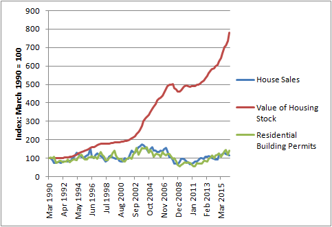
The graph above tracks three aspects of the NZ housing market, from 1990 to 2016:
- The total value of NZ’s housing stock as calculated by the Reserve Bank
- The number of residential units authorised by building consents
- The number of residential house sales.
To ease comparison, the numbers have been translated into an index with 1990 being 100. I can’t find the same figures for just the Auckland Region.
The value of the national housing stock has increased eightfold over the period 1990 to 2016. The number of dwellings sold and the number of permits issued each year for new units has barely budged. What is interesting is how closely the number of permits issued tracks the number of house sales, rather than the value of the housing stock.
The graph typically prompts the question:
Why has the number of building permits not responded to the price signal generated by the ever inflating value of the housing stock? There must be a blockage.
A deficit of housing is necessary to explain the increase in house prices (demand exceeds supply). Supply-side economics (the current vogue) always looks for blockages to explain things.
The alternative question of whether the growth in the value of the housing stock reflects the accumulation of excess capital is less often asked. But let’s come back to that.
First up, is poor planning (i.e. the lack of zoned land or development opportunities) holding back the response of the building industry? The above figures are national figures, if we just look at the Auckland Region, then since 2011, when the Region began to come out of the GFC, building permits issued have increased, as follows:
June Year
|
Building consents for new dwelling units
|
2011
|
3,394
|
2012
|
4,197
|
2013
|
5,343
|
2014
|
6,873
|
2015
|
8,300
|
2016
|
9,651
|
The Minister of Housing usually attributes this increase to the Special Housing Areas identified across the city since 2013. These SHAs have opened up land previously locked up in the planning filing cabinet.
However when you read the SHA monitoring reports, such as the latest one - Second Quarterly Report for Third Accord Year October 2015 to September 2016 - a different picture emerges. Most of the above consents are issued outside of SHAs. So it is the day-to-day zonings of the legacy operative plans that are in place that is providing the capacity. Not the zonings under the Proposed Unitary Plan (which is only just kicking in), or the SHAs.
The following is in the October 2016 Monitoring Report (page 28):
In Accord Year 1 to 30 September 2014, 429 new residential dwellings were consented in special housing areas. In Accord Year 2 to 30 September 2015, a further 797 dwellings were consented bringing total dwellings consented in SHAs since the start of the Accord to 1,226. The first half of Accord Year 3 has seen a further 524 new dwellings consented in SHAs to 31 March 2016, bringing the total to 1,750 dwellings. (Source RIMU, Auckland Council). This is over 8% of all dwellings consented in Auckland over the 3 year period. In the first half of Accord Year 3 the 524 dwellings consented in SHAs was 11% of 4,799 total dwellings consented in that period.
So over the 3 years 2013 to 2016, 8% of new dwelling permits issued were in SHAs. That means 92% were not. The 8% may be an important addition, but it is hard to see a lack of operative zonings being the main constraint on delivery of houses, given the numbers now being issued.
But when the number of building consents are compared to the population growth, then the number of consents are lagging behind. If we use a simple approach of comparing population growth, housing demand and housing supply for two three year blocks from 2010 to 2013, then the following is calculated:
Period
|
Population growth (estimate)
|
Dwelling demand @3 people per dwelling
|
Number of building consents issued for new dwellings
|
Deficit
|
2010-13
|
53,600
|
17,867
|
12,934
|
-4,933
|
2013-16
|
121,200
|
40,400
|
24,824
|
-15,576
|
This is a standard type analysis of the housing ‘deficit’. If you go back further, the deficit increases. During the period 2008 to 2010, there was a big decrease in building. But that was the GFC, not lack of zoning.
So how to explain this deficit? Maybe what is zoned for development is expensive and difficult to develop, so less housing than needed is developed. There is some truth in that, as the stock of development enabled by plans developed in the 1990s steadily gets eroded, but the SHA monitoring report data hardly backs that up as being the main reason for a deficit.
So if zoned capacity is not holding things back, then what else is going on?
One explanation is that:
- In the short run, housing supply tends to be very price inelastic;
- The development market is a market prone to sentiment;
- Housing development is risky, lengthy, and an increasingly debt financed business.
These ‘soft’ factors affecting the responsiveness of the building industry are rarely considered, I presume in part because (like most markets), the industry is not necessarily totally responsive to price signals, which suggests some issues with regard to demand/supply relationships.
Getting back to the ‘deficit’, if we assume that building consents lag population growth by a year or so (it takes time to get plans ready and get them approved by council, more hammer hands have to found. Tried getting a plumber recently?) then the deficit comes down. That is, lets assume the number of consents issued for the 2010-13 demand is based on the numbers issued in 2011 to 2014. Likewise for the period 2014 to 2016, plus a guess for 2017. If we assume that between June 2016 and June 2017, 10,000 building permits will be issued (easily anticipated in the above trends on building permits issued), then the following figures can be generated:
Pop growth estimate (June Years)
|
Dwelling demand @ 3 people per dwelling
|
Number of consents issued (1 year lag)
|
Deficit
| |
2010-13
|
53,600
|
17,867
|
16,413
|
-1,454
|
2013-16
|
121,200
|
40,400
|
27,951
|
-12,449
|
So between 2011 to 2014, maybe the housing development market wasn’t so out of step with demand from the period 2010 to 2013. Taking into account the lingering effects of the GFC still being felt in the 2011 building consent figures, it is not a bad result.
But what about 2013-16? Still a deficit. Yes it is, but also population growth was much higher, more than double the previous three year period.
Now let’s look at the issue of sentiment. How certain can developers and builders be sure of the population estimates provided? The population growth is being driven by migration. If migration swings upwards quickly, it can also swing downwards quickly; there is a risk. If you are building 20 or 30 units in a complex, what are you going to assume will happen in 2 or 3 years time when the development is complete? While talk of deficits helps with the idea of a bunch of willing buyers lined up to buy, it still feels a bit risky. Sentiment is probably the reason why building permits so closely track house sales, rather than population growth or growth in the value of housing stock.
If we look at the actual components of population change over the period 2010 to 2016, what is striking is the huge increase in the 15 to 39 year old category between 2013 to 2016. The following are the Stats NZ estimates of population growth in the Auckland Region by age band.
Figure 2: Population growth - Auckland Region, 2010 to 2016
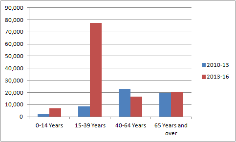
So the housing market had to not only anticipate the doubling in population growth in the period 2013 to 2016, but also the huge increase in the number of 15 to 39 year olds? As the media has been pointing out, much of that growth is related to foreign students and people on temporary work visas. Granted, many of whom do want to stay in NZ, but from the housing market point of view, they are an unknown quantity.
Now it may be entirely rationale for house builders to say “I'm not too sure about this spike in 15 to 39 year olds.”Will they stay"? ”Once they get residency, will they all take off to Australia?” It seems a bit tough to say that builders and developers will leap to their feet to meet this spike in demand with out first taking some deep breaths.
If we take a complete stab and say that the demand for housing from this age group (not demand for lodges or other forms of temporary accommodation) is about half the increase estimated, then you get the following picture for 2013 to 2016, again assuming a 1 year lag:
Pop growth (estimate)
|
Dwelling demand @3 people per dwelling
|
Number of building consents issued (1 year lag)
|
Deficit
| |
2010-13
|
53,600
|
17,867
|
16,413
|
-1,454
|
2013-16
|
121,200
|
27,500
|
27,951
|
+ 451
|
The 27,500 demand figure for 2013 -16 is based on 121,200, less half of 77,500, divided by 3.
Suddenly there is no deficit, and the housing market could be said to be acting in a rational manner (given its characteristics).
Now I agree that I made some leaps with the above figures, but they are not improbable leaps. Developers also have to make leaps in terms of assessing demand. Financiers are likely to make similar assumptions about the sustainability of demand. Certainly employment growth has been strong in the Region, but not so strong to say that the above population growth figures are ‘real’. Sentiment about the future is as important to the housing market as any other market, more so now that it has a strong investment component to it and that there is a large reliance on bank finance.
So is there really a deficit (maybe there is a hangover from the GFC, but that is a different story) that is driving house prices?
And yes, before you ask, setting aside the deficit issue, more housing capacity as provided by the Auckland Unitary Plan is a good thing, along with more options for different housing choices, but will it affect house prices?
Geoffrey Meen has written about the factors affecting house prices and affordability. See for example his recent lecture to Sydney University: HOUSING AFFORDABILITY IN AUSTRALIA AND THE UK: COMMON PROBLEMS AND COMMON SOLUTIONS (1). His main message: “the trickle down effects of a general expansion in housing supply are likely to be modest”. In part this is because the private sector will not run ahead of demand. Housing affordability for the lower ends of the income spectrum will remain a problem. Where have we heard of trickle down effects before?
Finally, back to the graph at the start. If we add in money supply (M3) as measured by the Reserve Bank into the picture, then we get the following graph, but starting from 2001, as that is when the data is available.
Figure 3: Value of housing stock, M3 money supply, house sales and building permits, NZ
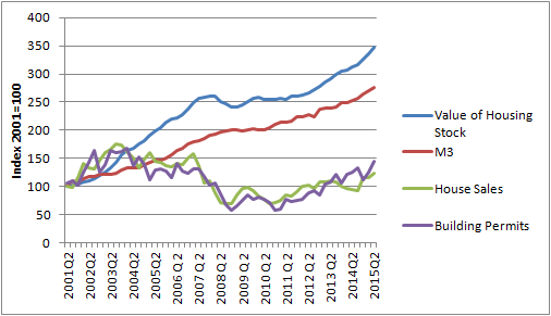
M3 is a measure of the total money supply in the economy. Now, is that supply growing in response to the growth on housing value, or is it the other way around? Certainly the growth in house values seen in the last year outside of Auckland suggests that the rise in house values are far from a land supply issue.
Something to think about over the summer break.
- http://sydney.edu.au/halloran/publications/MEEN_housingAffordability.pdf