AUT’s Policy Observatory series has released a couple of interesting papers about housing markets and house prices. Both have implications for the basis of the recently released National Policy Statement on Urban Development Capacity (NPS UDC). The NPS UDC was basically founded on the following statement:
“Existing RMA land use planning practices appear to respond poorly to the opportunities and challenges arising from urban development. In particular, planning policies can constrain development capacity and limit the ability of the market to meet demands in growing cities. This results in a limited supply of housing and rising property prices, as well as some localised problems meeting demands for business space.”
Notice the direct link drawn between rising house prices, limited housing supply and constrained development capacity. Rising house prices must be the result of constrained land supply which in turn is the result of planning. Planning will always constrain some capacity in some parts of the city for good reason and so the statement is true to an extent. Maintaining amenity and protecting the environment will also be reflected in higher house prices than might otherwise be the case. Whether capacity is constrained to a point that it unnecessarily puts pressure on house prices doesn't seem to have been tested. Neither does the effect of other influences on house prices.
But first a bit of context.
Annual net migration into NZ reached 72,000 in the year to May 2017 year, Stats NZ said on 22 June 2017. About 50% of migrants (people intending on staying in the country for more than a year) settle in Auckland, say 35,000 people. Add another 15,000 from natural increase and that is a population increase of 50,000 people. Divide by 3 and there is demand for 16,600 dwellings!
In the 12 months to May 2017, 10,200 dwelling units were issued building consents in the Auckland Region.
At the same time Quotable Value NZ reports that house values across the Auckland Region are continuing to plateau with values increasing by just 0.1% over the past three months.
So what is going on? Perhaps all that extra dwelling capacity enabled by the Auckland Unitary Plan has done the trick. While the number of building consents hasn’t really budged yet, maybe some of the steam in the land market has been released as more development opportunities come through from the rezonings? Hence house prices plateauing. Next we will see house building accelerate.
Of course there may be bigger forces at play.
As I have previously commented on:
- The number of building consents issued is likely to lag population growth by at least 12 months.
- Demand for housing generated by the high net migration figure is not clear cut. Between 1 January and 21 December 2016, 31,881 people were granted New Zealand citizenship, much less than the number of people counted as migrants. If we took the 30,000 figure as the true demand for housing, then assuming about 15,000 new citizens live in Auckland plus the 15,000 natural increase, there is a demand for10,000 dwellings.
- The number of building consents issued closely follows the number of house sales - less house sales means less buyer confidence, so less building consents get prepared.
- Over the last 20 years or so land prices have risen substantially close to the core of Auckland, a reversal of the pattern post WWII when they fell, as transport accessibility profiles have changed.
- The planning process has always delivered development capacity, but maybe not always in the right location in terms of market demand, but then the role of planning is to manage that demand for long term benefit.
So there are a number of factors to say that the basic hypothesis of limited development opportunities means restricted housing supply which in turn means higher house prices is not so straightforward.
The role of monetary conditions in this mix is not clear, but must be relevant. Finance (interest rates, availability of credit, excess capital looking for a return) has major implications for house prices, with asset inflation much more prevalent than general price inflation over the past decade.
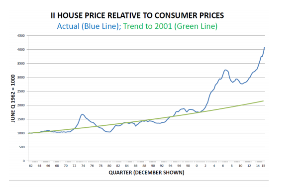
Brian Easton in his Policy Observatory paper has recently looked at the relationship between house prices and consumer prices in NZ, over the period from the 1960s to 2016. Below is a graph from his report for the AUT Policy Observatory website. He notes that house prices saw an abrupt increase around 2000. What explains this abrupt increase?
Below is a graph from the Economist website that I have cut and pasted as a screenshot. It tracks house prices relative to rents. In the website, you can click on any number of countries. I have highlighted Australia, Britain and Canada - our Commonwealth cousins.
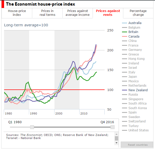
The same upward track in the early 2000s is evident across all four countries. What happened in 2000 that suddenly propelled house prices to start to leap ahead of what rents would suggest would be a fair price, in all four countries at the same time? Was it because we share a similar planning heritage? Did all the main cities in these four countries suddenly bump up against their different urban limit lines at the same time, while NIMBYs across the countries united at the same time into some sort of anti growth flash mob?
Usually at this point in the story we get some sort of homily about markets (as per the following from the Market Urbansim website see note 3):
“In an unhampered market, of course, as rents rise, housing developers will respond by building more housing where it’s needed most — and thus potential prices are highest. Rents will then fall in those areas and developers will stop building housing — or build in other places — until rents rise again. Or, in response to rising rents, current homeowners will turn their homes into boarding houses. Others may build so-called mother-in-law suites over their garages. The number of ways to expand housing is actually quite long”.
For rents, read prices.
In an unhapmered market?
This is then usually followed by reference to the thicket of planning controls that restrict (hamper) supply.
In an unhapmered market?
This is then usually followed by reference to the thicket of planning controls that restrict (hamper) supply.
In NZ, read some analysis and it suggests that zoning has always constrained supply and that by the early 2000s, the situation had become dire in Auckland at least, as the old ARC tightened the MUL noose around Auckland. Hence the rise in house prices. But by how much was housing capacity in Auckland constrained over the period around the turn of the century? The table below is from the ARC’s 2006 capacity for growth study (note 4). Between 1996 and 2006 housing capacity increased in the metro area, not decreased.

Housing capacity (as measured above) grew faster than dwelling growth. The figures above are of the ‘head room’ in the system. The capacity listed is in addition to the existing dwellings. There was also a pipeline of rezonings that were underway or being investigated.
It can be argued that not all of the capacity measured in the 2006 (or earlier) study would be available for development. Not all of it might be commercially feasible, for example. A chunk of it was in town centres and business areas - possibly less attractive for buyers. Maybe more capacity would be better, but it seems a bit steep to say that the sudden rise in house prices in the early 2000s is all down to bad planning.
Crucially if housing capacity was constrained relative to the growth of the population, then rents would have moved up at the same pace as house prices.
Crucially if housing capacity was constrained relative to the growth of the population, then rents would have moved up at the same pace as house prices.
Brian Easton contends that the acceleration in the relative premium after 2001 coincides with President George W. Bush increasing the United States’ fiscal deficit which flooded the world with financial liquidity. That made it easier for New Zealand banks to borrow offshore using the cash to fund housing purchases.
Even the Market Urbanism article mentioned above refers to the possibility of asset inflation.
Even the Market Urbanism article mentioned above refers to the possibility of asset inflation.
Certainly, a major factor behind growth in home prices is asset price inflation fueled by inflationary monetary policy. As the money supply increases, certain assets (like real estate) will see increased demand among those who benefit from money-supply growth. These inflationary policies reward those who already own assets (i.e., current homeowners) at the expense of first-time homebuyers and renters who are locked out of homeownership by home price inflation.
In March of 2017, The Economist magazine reported that since autumn 2014 $1.3trn of capital has flowed out of China. Some of that cash has found its way into residential property in some of the world’s most desirable cities.
In March of 2017, The Economist magazine reported that since autumn 2014 $1.3trn of capital has flowed out of China. Some of that cash has found its way into residential property in some of the world’s most desirable cities.
But these explanations of rising house prices are not as exciting as an explanation associated with a so called regulatory failure.
Of course, lack of development opportunities in the right area could be a constraint on housing production and maybe part of the problem. So maybe a potential constraint on housing production is present (i.e. lack of development opportunities in some places), but that constraint may not be (and may never have been) the governing constraint.
Professor John E. Tookey of Auckland University of Technology in his Policy Observatory report: ‘The Mess We’re In: Auckland’s Housing Bubble from a Construction Sector Perspective’ puts it this way:
In any case, merely making more land available for development by selling Crown land, or permitting subdivisions, or easing green belt restrictions, will not radically change the market. Because no one is compelling land acquisition; no one is compelling development; no one is forcing builders to build. The market cannot be forced to operate at a loss, or at a rate of production it does not wish to operate at. Ergo, the consequence will be very limited increases in total output – in this case, constructed houses. The only way to increase the total number of houses constructed on newly available land is to compel its rapid development ahead of the market. Anything less simply allows the market to settle at an equilibrium that sustains prices and values at the limit of what is supportable by the general public. What that translates to, in reality, is that government needs to compel industry through the profit motive and economies of scale as they have done so in the past; specifically, by building council- or co-owned housing for low income households.
2, http://marketurbanism.com/2017/05/17/how-governments-outlaw-affordable-housing/
3. http://www.economist.com/news/finance-and-economics/21718511-bolthole-money-welcome-comes-unintended-consequences-foreign-buyers
4. Capacity for Growth Study 2006 March 2010 TR 2010/014
3. http://www.economist.com/news/finance-and-economics/21718511-bolthole-money-welcome-comes-unintended-consequences-foreign-buyers
4. Capacity for Growth Study 2006 March 2010 TR 2010/014