I ended my previous blog on the city as a labour market with the call for planning to improve affordability and mobility. Sounds reasonable. “Mobility” is the ability to reach any area of a metropolitan area in as short a travel time as possible, and “affordability” is the ability of households and firms to locate in whichever area they deem will maximize their welfare” (See note1). But whose mobility and accessibility should be improved? And can you do both at the same time - improve mobility and affordability?
 Improved mobility will help improve people’s welfare. The more jobs that are accessible, the better the job prospects and in theory at least, better productivity and regional GDP. Improved affordability means that more people can move into or stay in a (growing) big city and participate in the economic benefits. If house prices are too high, then growth may stall and people may move out, so maintaining affordability is important.
This is the basic idea of the city as labour market as advanced by Alain Bertaud. In his view, productivity (and hence GDP) is not just determined by city size, but also by its layout and transport system.
Bigger cities are supposed to be more productive than smaller cities. A city that doubles in size should see per capita GDP increase by about 115%, all else being equal. The evidence from Auckland is somewhat mixed. It is a bit more productive that other cities in NZ, but not by much, on a per capita basis.
Table 1: Regional per capita GDP 2016
Region
|
Regional GDP per capita (2016)
|
Population estimate (2016)
|
Auckland
|
$58,717
|
1,593,100
|
Wellington
|
$54,565
|
501,100
|
Canterbury
|
$55,727
|
594,100
|
(Source: Stats NZ)
If we compare Auckland with the other two metro regions in NZ (Wellington and Christchurch), then Auckland's per capita GDP is about 6 to 7% higher, yet Auckland’s population is more than double the other two regions. Could the answer to this ‘disjoint’ lie in the arrangement of jobs and houses in Auckland?
If we compare Auckland with the other two metro regions in NZ (Wellington and Christchurch), then Auckland's per capita GDP is about 6 to 7% higher, yet Auckland’s population is more than double the other two regions. Could the answer to this ‘disjoint’ lie in the arrangement of jobs and houses in Auckland?
In this blog I want to look more closely at the mobility side of the mobility/affordability equation.
Alain Bertuad contends that workers’ mobility – their ability to reach a large number of potential jobs in as short a travel time as possible, is a key factor in increasing the productivity of large cities and the welfare of their workers. Large agglomerations of workers do not insure high productivity in the absence of worker mobility. The time spent commuting should, therefore, be a key indicator in assessing the way large cities are managed.
To help explain the need to improve accessibility, Alain Bertaud sets out a simple city, as per the diagram below. This shows a cross section through a city that extends between points ‘a’ to “e’. Employment is concentrated at points “b”, “c” and “d” with housing in between. The city takes 2 hours to traverse from edge to edge.
Figure 1: The city as a labour market
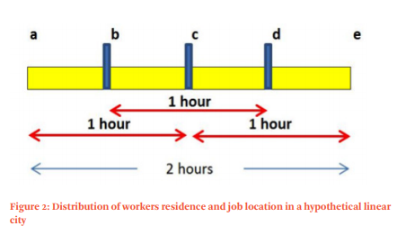
If each job location (b, c and d) had 33% of the cities employment, and 1 hour was the maximum commute, then people living between b and d could access 100% of the jobs, but people living between a and b or d and e could only access 66%.
So to improve accessibility, either more people need to live in between ‘b’ an ‘d’, or accessibility from ‘a’ to ‘b’ and ‘d’ to ‘e’ to the rest of the city needs to be improved.
Of course, the edges of a city are never going to have the accessibility of the centre. There is a travel time penalty for living out on the edge. This penalty is reflected in the land prices. Land prices are higher in the middle / centre due to the better accessibility and therefore higher demand. Land prices and hence house prices are lower on the edge due to higher transport costs. Improve accessibility to the edges and affordability probably goes down. Affordability is then improved by moving further out again to areas of lower accessibility, and so it goes on. The alternative is that relative housing affordability is maintained in the face of improved accessibility and higher land prices by less land and floor area area per person (aka intensification).
In Auckland, we get constant calls to improve affordability by adding more land onto the edge of the city, but without improved accessibility, is that just a short term fix, at best? This is setting aside the more basic problem that Auckland's built up area is probably at the edge of its commuter shed, as it is.
In Auckland, we get constant calls to improve affordability by adding more land onto the edge of the city, but without improved accessibility, is that just a short term fix, at best? This is setting aside the more basic problem that Auckland's built up area is probably at the edge of its commuter shed, as it is.
The 33% of employment in the 3 areas of employment in the simple model above is unrealistic. The centre is always likely to have a bigger share. If points “b” and “d” only had 25% of employment each, with 50% at point “c”, then people living between “a” and “c” actually have 75% of employment within an hour. Interestingly, trying to get a more even split of employment between the three nodes actually reduces accessibility. Concentration tends to increase accessibility.
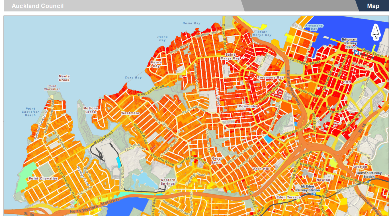
Looking at Auckland, the pattern of employment in Auckland is skewed towards the centre and south. Below is a the number of jobs per Local Board area, with the Boards arranged roughly north to south. I have dropped off the ‘rural’ Boards of Rodney, Great Barrier, Waiheke and Franklin.
Figure 2: Number of jobs by Local Board area, 2016
North-West
|
Central
|
South-East
|
There are two main points of concentration - the central isthmus and the ‘mid-south’.
In percentage terms, about 25% of jobs are in the central Isthmus area covered by the Waitemata Board.
Figure 3: Percentage of regional jobs, Auckland Local Board, 2016

The Local Board areas from the centre out to the north and west accommodate about 50% of regional jobs, while the Local Board areas from the centre to the south and east cover about 75% of regional jobs. So is the south and east the best place to expand housing capacity?
In terms of growth and change, the northern and western parts of the city have added some jobs. If we look at the change in employment between 2001 and 2016 by Local Board we get the following picture.
Figure 4: Change in number of jobs, 2001 to 2016, by Local Board
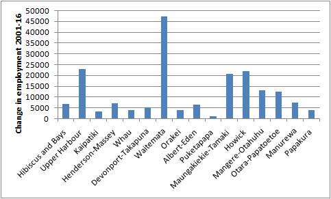
A bit of a bump in the Albany / North Harbour area, but not much when compared to population growth. However putting more people down south may not be the best place either. Geography does come into play here. Auckland is elongated north to south by its Isthmus form. The south extends further to the south than the north extends to the north.
Previously I have referred to the Marchetti constant - the one hour commute per day (ie 30 mins each way) as being a very common metric as to what most people find tolerable. In a bigger city, one hour per day may be a bit of a luxury, but it is nevertheless a valid rule of thumb. How far can you get in 30mins? Depends upon the transport system. I have used a 15km radius as a rough and ready estimate of a 30 minute commute (ie assume an average speed of 30km per hour).
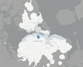
As a check, go to mapnificent (see note 2), plug in 30 mins and you get the following map for Auckland central. Mapnificent shows you the area you can reach with public transport from any point in a given time (although Im not too sure of the details as to the travel times involved, but it looks about right).
This is about a 10km radius. A 30 min PT shed is probably a bit of a smaller area than a 30min car trip. The same map for South Auckland is as follows:

For access to employment, I have taken an estimated mid point on the North Shore and an estimated mid point in the south and drawn two 15km radius circles. See Figure 5 (note, my GIS skills are not that hot, so for some reason the circles have come out more like a lozenge than a circle, but you get the idea. The lozenge shape actually better fits Auckland’s geography than a circle).
As a check, go to mapnificent (see note 2), plug in 30 mins and you get the following map for Auckland central. Mapnificent shows you the area you can reach with public transport from any point in a given time (although Im not too sure of the details as to the travel times involved, but it looks about right).

This is about a 10km radius. A 30 min PT shed is probably a bit of a smaller area than a 30min car trip. The same map for South Auckland is as follows:

For access to employment, I have taken an estimated mid point on the North Shore and an estimated mid point in the south and drawn two 15km radius circles. See Figure 5 (note, my GIS skills are not that hot, so for some reason the circles have come out more like a lozenge than a circle, but you get the idea. The lozenge shape actually better fits Auckland’s geography than a circle).
Figure 5: 15 km radius estimates - north and south.
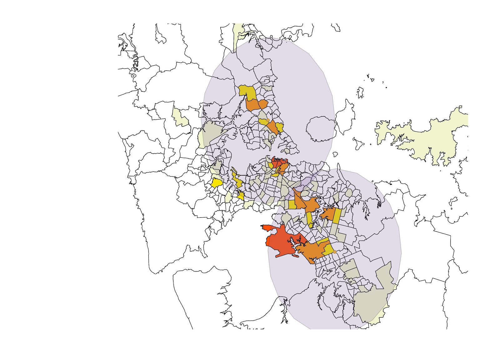
The North Shore 15 km radius reaches most of the Isthmus. The southern based 15km radius just touches the southern part of the Isthmus.
Applying this approach to northern, central, western and southern sectors, then we get the following figures as to the number of jobs within a 15km radius.
Figure 6: Number of jobs within 15km of central point, by urban sector, 2001 and 2016

Figure 7: Percentage of regional jobs within 15 km radius
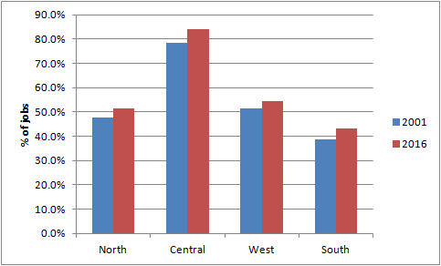
The south-south east has the lowest number of jobs close by. Just over 40% of regional jobs are within a 15km radius compared to 50% for the north and west. Being in the central area is by far the best place to be. No surprises it is also the most expensive place to live.
However jobs in the south are growing, so that is positive. Warehousing and distribution are the two industrial sectors that Auckland has a bit of an advantage in, compared to the rest of the country. The map below shows the location of warehousing and transport jobs, as of 2016.
Figure 8: Number of jobs in transport and wholesale, 2016
There is a concentration in the central south. When we look at the home location (as of 2013) for those working in the warehouse and transport sectors (ANZSIC F and I), we get the following pattern. This map shows the percentage of all workers resident in an Area Unit who are employed in the F and I sectors. Across the region as a whole, about 11.5% of workers are employed in transport and warehousing.
Figure 9: Percentage of workers in wholesale and transport sectors, 2013, by home location

While there is quite a strong correlation between workplaces and home location in the south for those in the F and I sectors, there are also plenty of workers resident in the north and west who presumably need to travel to the southern Isthmus.
On the other side of the coin, access to the higher paying jobs in the business services sector located in the centre, from those living in the south is not as good as for those living in the centre, west and north.
Auckland is kind of grappling with these issues. The Auckland Transport Alignment project (see note 3) identified that two key growth distribution trends are:
• Population growth is spread throughout the Auckland urban area and extends into major future urban growth areas to the north, northwest and south of the existing city. Nearly a third of population growth is projected to occur in areas beyond 20 km of the city centre.
• Employment growth is highly concentrated in a few locations, particularly the city centre, the Airport and other major metropolitan centres. Over a third of employment growth is projected to occur within 5km of the city centre. The growth in service sector jobs, which often prefer to locate in major centres to benefit from agglomeration, is a key force behind the projected concentration of employment growth.
Accessibility from the west and south to employment is likely to decline in the future, as congestion worsens.
These accessibility projections highlight a significant unevenness to future employment accessibility and a growing polarisation of access to employment in the future. By 2046 more than a million people will be living in the western and southern parts of Auckland, nearly half the region’s population. However, these areas see relatively little improvement in their access to employment over time, particularly by private vehicle. The wider implications of these areas being at least partly excluded from the benefits of Auckland’s expanding employment base over the next 30 years are potentially significant, particularly given they include parts of Auckland with higher levels of deprivation, as well as a number of key future urban growth areas.
I'm not too sure about the extent of concentration of jobs in the central area that the Alignment project has assumed. If population growth is to occur in the southern or western edges (as per the call by Minister Twyford to remove the RUB), then fast, frequent transport links into the central Isthmus will be critical to regional productivity and associated housing, social and economic outcomes. And by fast, I mean more than a shoulder bus lane. Even the train needs speeding up - it takes 50 minutes to go from Papakura to Britomart. Furthermore, that investment in transport links needs to go in now, ahead of development if it has any hope of shaping land use and transport patterns. No sign of that, either.
But with improved accessibility to and from the south and west, will land prices rise and hence affordability drop, unless density of housing increases?
- http://marroninstitute.nyu.edu/uploads/content/Cities_as_Labor_Markets.pdf
- https://www.mapnificent.net
- Auckland Transport Alignment Project - Foundation Report.