 In my previous post on working from home I speculated on the residential locations that might be affected by a large take up of people working from home. There is conjecture that freed from having to travel daily into central workplaces, and the associated long commutes and high house prices, many office-based workers will spread out into the countryside as they look for a better home-work balance. Of course, to make it all work, most people in the household would need to be able to work from home; not much use relocating to the countryside if one member of the household can work remotely, but the other is tied to a desk in a central city workplace. The down side of more working from home could be a quieter central area and reduced passenger transport use.
Census data suggests that many current ‘work-from-homers’ live in high amenity suburbs in the central Isthmus and along the eastern seaboard of the city, and so may see little point in shifting to somewhere else. But maybe newer households to be formed by people that can work from home will think differently about where to live in the future, especially if housing is cheaper in towns further away from the main urban area? In particular, will small towns within 2 hours drive of Auckland see an upswing in demand? Places like Muriwai, Warkworth, Matakana, Waiuku, Raglan and Waihi Beach? Why two hours? It is a doable trip in a day if you have to go into work one day a week, or for an in-person meeting.
It is early days and any trend towards the growth of 'satellite' townships may be a few months off. The question of how big the trend may be remains unclear.
Census data suggests that outer lying townships have higher rates of working from home than the main urban area. 2018 data suggests that about 12% of workers who live in Warkworth work from home, up from the 9% for the region as a whole.
Google mobility data (note 1) gives us another perspective on the impact of Covid 19 on the city and people’s movements, and with it some possible clues as to what may happen.
The data shows how visitors to (or time spent in) categorized places have changed over the past 6 months or so, compared to a baseline, being the median value from the 5‑week period Jan 3 – Feb 6, 2020.
The mobility data is created with aggregated, ‘anonymized’ sets of data from users who have turned on the Location History setting on their mobile phones, which is off by default. The data is presented as the percentage change from the baseline value.
Data is available for the Auckland Region as a whole. No sub regional data is published.
Data is presented for six types of activities:
- Retail and ‘recreation’
- Supermarkets
- Public reserves
- Transit stops
- Workplaces
- Residences.
First up, the 'retail and recreation' catrgory is useful to look at to see how the data is presented. The graph below shows the percentage change in visits to retail places in the Auckland Region, from the per covid baseline data. The pattern of a steep fall off in visits to retail premises in the first lockdown is clear, along with a smaller fall in the second lock down.
(Note: In all the graphs, the data is presented as a % change on the 'baseline' and is for the Auckland Region - as defined by Google)

The google data suggests that visits to retail premises are back up to pre covid levels. However, the data can't tell us about visits to specific retail areas.
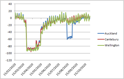
If we compare the Auckland region with the Wellington and Canterbury regions, we can see the dip in the Auckland region in the 2nd lock down, but not Wellington or Canterbury, so the data looks pretty good.
Before I look at the data on workplaces and residences, spare a thought for Melbourne. The below graph shows Auckland and Melbourne.

Turning to whether the data shows any trends as to working from home, the data on visits to workplaces and residences tend to be a mirror image of each other. Visits and time spent in workplaces in the Auckland Region took a big dip during the first lockdown, and then another, lesser dip in the second lockdown.

The one off, downward spike in late October was Labour weekend.
The baseline data period used in the analysis was over our summer break (January), so the baseline may be an incorrect measuring point for workplace visits. Certainly looking at the graph, the period mid February to mid March (pre lockdown) was about 20% above the January baseline. If we take the mid Feb to mid March period as being the relevant baseline, then mid October is about 20% below the early February period, with workplace visits more akin to a ‘holiday period’. The period between the two lockdowns is also at this lower level, suggesting a more than temporary reduction in workplace visits. Having said that, it is not clear from the google data if visits to tertiary educational facilities were counted as workplace visits.
Turning to residences, the baseline data seems a better starting point, with the mid February to mid March period about the same as the baseline period. Time spent in residences was 5 to10% higher than the baseline during the period between the two lockdowns.

The smaller increase in time spent in residences compared to reduced time spent at workplaces is possibly due to the overall larger number of people likely to be at home, once students are added in.
The big surprise in the Google data is use of ‘transit stops’. Use of transit is well below the baseline, at least 40% down. Is this the flow on effect of the 20% reduction in workplace visits? Perhaps it is reasonable to say that many of the people who would be working from home were public transport users who would likely benefit the most from not having so long to commute in the morning and evening.
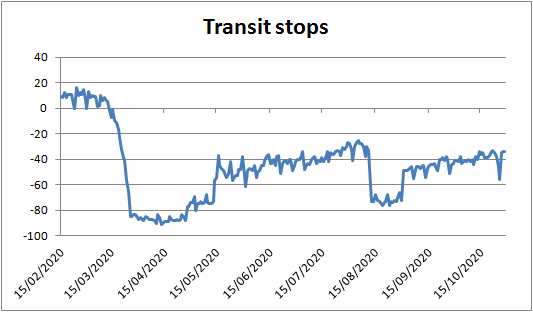
Google says that Transit Stops covers subway stations, ports, taxi stands and highway rest stops. So a mixed bag.
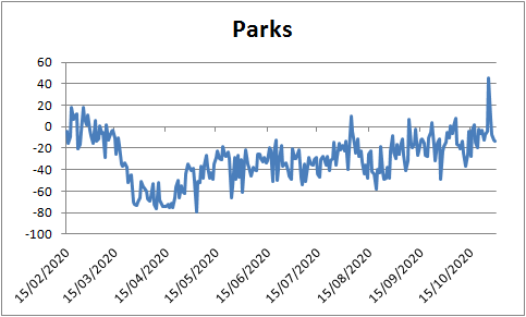
To complete the picture, what about parks and open spaces? Surely a big rise in visits during the lockdowns? But the figures suggest otherwise. Maybe the cancellation of organised sport is reflected in the figures.
A reduction of 20% in workplace 'visits' as recorded by google may mean that all workers are working from home for one day a week. But it is likely that working from home will be concentrated in certain groups. NZTA (see note 2) suggests that in Auckland, in November, about 18% of workers are mainly working from home, well down on the peaks during the lockdowns, but higher than pre-lockdown (when about 9% of workers were working from home - which is close to the census data).
So what if an extra 5 to 10% of future workers did think that they could work from home, and therefore live outside the Auckland urban area?
Forecasting employment is difficult in the current circumstances. Between 2015 and 2020, the Auckland region added about 110,000 jobs. This is a fast rate of growth. If the next 5 years saw a similar growth, then about 10,000 workers may decide to locate elsewhere. This may equal about 6,500 dwellings. This may mean big growth for little towns, but not much of a difference for Auckland.
But what happens if, say, 8% of existing workers decide that the accpetance of remote working means that they can shift out of the urban area? In 2020, there were just over 807,000 jobs in the region, so lets say 686,000 are in the urban area (85% of total). 8% of this number is 55,000, or perhaps 84,500 people. This means about 28,000 dwellings may come 'free'.
As for the Central Area of Auckland, the below graph is from the Heart of the City website (see note 3). It is based on real time counts of pedestrian traffic near the foot of Shortland Street. Shortland Street has a grouping of high rise office blocks. Data for the period 17 to 21 November suggests an average predestrian count of about 250 people per hour in the mid afternoon, well down from the 700 people over the same time last year. The twin mountain peaks of lots of people out at lunch time and after work are replaced with a smooth low rise 'hill'.

Notes:
1. https://www.google.com/covid19/mobility/
2. https://www.nzta.govt.nz/assets/resources/covid-19-impacts-on-transport/waka-kotahi-nzta-COVID-19-tracking-core-report-wave-23-20201117.pdf
3. https://www.hotcity.co.nz/city-centre/results-and-statistics/pedestrian-counts