Friday, 27 October 2017

The city as a labour market: 2


In my last blog, I looked at the types of jobs being created in Auckland, over the period 2001 to 2016. Of note has been the big increase in the number of jobs in the professional, science and technical services sector (sector M in the ANZSIC). In this blog I want to look more closely at this sector.

Maybe one of the roles of planning is to positively support the growth of areas of employment where the city has a comparative advantage.

The relative importance of the sector for Auckland, compared to the national economy, can be assessed in simple terms by calculating a location quotient. Infometrics, in their Auckland Economic Profile web page (1) note that:
A high concentration of certain industries in an area can be indicative of the area having a comparative advantage in these industries. This comparative advantage may be a result of the area’s natural endowments, location, skill profile, or other reasons.
Location quotients (are used) to identify what industries an area may have a comparative advantage in. An area has a location quotient larger than one when the share of that industry in the area’s economy is greater than the share of the same industry in the national economy.
Industry sectors in Auckland that have a location quotient greater than 1.1 are as follows, based on 2016 data.
Figure 1: Location Quotients over 1.1, Auckland Region, 2016


As a comparison, the location quotient for sector “C” - manufacturing - is 0.97.
The location quotients suggest that Auckland’s economy, beyond those parts of the economy that serves the resident population and/or is basically the same as the rest of the country, really falls into three groups:
  • Warehousing and distribution
  • Financial, insurance and banking
  • Professional services.
A more fine grained analysis of industry sectors will reveal further clusters. For example, there will be some types of manufacturing activities that are concentrated in the city.
The M sector is relatively important. It has a location quotient of 1.34, which is quite high.  
This is, however, a static picture. Comparing location quotients in 2001 and 2016 shows some changes in relative concentration. The table below lists the location quotients for 2001 and 2016, as well as the change in the number of people employed in the sector between these dates, for the Auckland Region.  
Table 1: Location Quotients  2001 and 2016, and employment change.
Sector
LQ 2001
LQ 2016
Change in employment 2001 to 2016
 F Wholesale Trade
1.62
1.49
7,600
 I Transport and Warehousing
1.14
1.15
6,300
 J Information Media and Telecoms
1.31
1.48
-300
 K Financial and Insurance
1.37
1.43
9,800
 L Real Estate Services
1.14
1.17
4,400
 M Professional, Scientific and Technical
1.31
1.34
31,000


So over the period 2001 to 2016, Auckland’s relative strength in the wholesale trade sector dropped a bit, but employment increased. On the other hand, the region’s strong advantage in information, media and telecommunications increased, but employment actually dropped in this category.
The professional, scientific and technical sector increased in relative importance and increased substantially in employment, as did the financial and insurance sectors.
Sounds impressive, but in terms of incomes and wealth generated by the “M” sector, the sector tends to be at the lower end of the higher paying jobs. Looking at contribution to GDP, the following data is provided by Infometrics. It is the average GDP generated per worker in the Auckland Region, for 2016, by industry sector.
Figure 2: GDP per employee, by sector, Auckland Region 2016
The productivity of those in the rental, hiring and real estate sector (at over $300,000 per worker) is a bit hard to understand. As noted the FIRE sector (finance, insurance, information, real estate) tend to be sectors with the higher salaries and the biggest contribution to GDP per worker, but haven’t grown so much over the past few years.
The general picture is of Auckland’s labour market growing and changing over time. The growth of the professional, scientific and technical services sector has probably helped to diversify the economy somewhat, which is positive. But it has mostly been a picture of the expansion of the ‘base’ of the economy, with the relative decline in the banking, finance and insurance sectors. The M sector has risen in importance but this sector is not a big contributor to regional GDP on a per head basis.
Next up, where are the jobs in the ‘M’ sector located?
Starting at the Local Board level, the concentration of jobs in the sector in the inner Isthmus area (Waitemata Local Board)  is very strong. See the following graph.  
Figure 3: Employment location, sector M, 2016, by Local Board.
Taking a closer look at the Census Area Unit level, the following maps the number of people employed in the sector, again for 2016, by workplace location. There is a very strong clustering in the inner city area, with smaller outliers in Takapuna and Ellerslie. The Upper Harbour Local Board area has more people employed in the M sector, than Devonport-Takapuna, but in the Upper Harbour area, they are spread over a wider area.  
Figure 4: Location of sector M employment, by census area unit, 2016


In terms of the other-side-of-the-coin, where do the people who work in the M sector live?
The following is a map of the percentage of people in full time or part time jobs employed in the M sector, for 2013 (the last census), by total number of people in work, by census area unit, by home location.
Figure 5: Location of home residence, people employed in sector M, 2013. Percentage of total workforce in Area Unit.
As about 11% of regional employment is in the M sector, then more than 10% of people who live in a census area unit and who are employed in the sector shows a relative concentration in terms of home location.
The map shows a very strong concentration of people living in the inner Isthmus and on the North Shore, as well as the rural North-West. The rural area units will not contain many people, so in actual numbers not percentages, most of the professional, technical and scientific sector workers will live in the city.
The fit between where people live and work in the M sector is pretty good from a planning perspective. Proximity helps a lot with accessibility. The sector will likely grow. More employment located in the city centre is positive, but will the future workers find a home location that fits their desires? If most of the future housing capacity is not in the Inner Isthmus or the North Shore coastal strip, then where do they go?  Are they all foot lose workers who might decamp to other cities and countries if they cant find their perfect home in the city?
So where does this all lead us? Well one purpose of planning is to ensure that the city has an efficient labour market. Alain Bertaud in his paper ‘Cities as a Labour Market’ makes the case for planning to support market processes:
“Increasing mobility and affordability are the two main objectives of urban planning. These two objectives are directly related to the overall goal of maximizing the size of a city’s labor market, and therefore, its economic prosperity.
“Mobility” is the ability to reach any area of a metropolitan area in as short a travel time as possible, and “affordability” is the ability of households and firms to locate in whichever area they deem will maximize their welfare”.
Sounds good. But is it that simple? Whose mobility and affordability do you plan for? Do we support the growth of the M sector, or try to slow the relative decline of the higher paying FIRE sector and its bigger contribution to GDP? Will improving affordability of the inner Isthmus and coastal areas (basically, a lot more houses in these areas) mean that the appeal of these suburbs to workers in the M sector will actually decline as lifestyle is important to them (being mostly city hipsters?). Or do you put your money into improving accessibility from other locations, such as from out in the rural north-west?
Next blog - what about all the other workers, especially the lower paid and less skilled? Where do they live and work?

(1) https://ecoprofile.infometrics.co.nz/Auckland/Gdp/ComparativeAdvantage

Wednesday, 11 October 2017

The city as a labour market


What type of jobs are offered by a city and the location of those jobs are important factors in shaping a city’s urban form. The type of jobs influences household incomes, while the location of jobs influences the demand to live in different parts of the city, for example.


As noted in my blogs of 6 June 2017 and 26 September 2016, in theory as a city gets bigger, then productivity per worker should increase and along with this, incomes. Yet the data for Auckland suggests only sluggish growth in productivity (as is true for the country as a whole). Many people have noted that household incomes had flat lined over the past 10 years or so, after allowing for inflation. Around the corner is the rise of robots and artificial intelligence. Is the future going to be a mix of “low-skill/low-pay” and “high-skill/high-pay” jobs?  How can we make the city more affordable for the low pay component, and not loose the high paying sector?  

On the location front, many jobs are locating in the central area, which is positive from the point of view of accessibility to labour markets, but also many jobs are locating in the south. Do we need to plan for more housing in the south, rather than to the north or west?
So what can the location and type of jobs in Auckland tell us about Auckland’s future urban form and what role might planning have in shaping that picture?
In this blog I want to look at the question of the type of jobs being created in the city. In another blog, I will look at location issues.

First up, the big picture. As of mid 2016, Stats NZ data recorded 724,310 people employed in the Auckland Region.  With a resident population estimated at 1,614,400, this equals 448 jobs per 1,000 resident. This is up from 429 jobs per 1,000 residents in 2001. So jobs have been growing faster than the population in general.  However over 2001 to 2016, the median age of Auckland’s population has dropped (not increased). The number of people of working age (as defined by the number of 15 to 65 year olds - not the most perfect classification these days of extended training for younger adults and more older adults working, but never mind) has increased from 67% of the total population in 2001 to 68% in 2016.
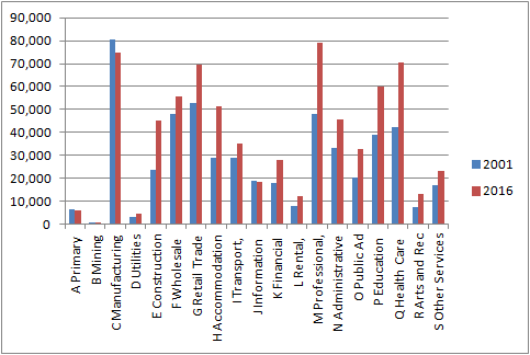
What type of jobs have increased the most? Below is the number of people employed in 2001 and 2016, organised by Stats NZ standard industrial codes. Note, the number of employees is the head count of all salary and wage earners. It therefore covers full and part time workers.

Figure One: Number of employees by industry sector, 2001 and 2016, Auckland Region
The expected pattern is the increase in the number of people employed in the service orientated sectors like education, health care and the retail trade; this is the story of the rise of the post industrial consumer city. But what stands out the most is the growth of the ‘M’ sector - professional, scientific and technical services.
The next graph organises employment change between 2001 and 2016 by the absolute change per sector, from the smallest to the largest change.  
Figure Two: Change in number of employees by industry sector, 2001 to 2016, Auckland Region


The on-going decline in manufacturing jobs is apparent. While the number of people employed has dropped, manufacturing output may have increased (fewer people, more automation for example).
Previous analysis of employment changes often stressed the growth of the FIRE sector - finance, insurance, information technology, real estate and the like - as the countervailing trend to the decline of manufacturing. But these sectors do not seem to have grown by much. Again output may be up, but employment is stable. It is possible that over the next few years automation and AI will have a big impact on the traditional ‘white collar’ jobs in the finance, banking and insurance sectors.
Some of the changes in employment are due to population growth. When we look at jobs per 1,000 residents, then the changes that are the result of structural shifts between 2001 and 2016 are more obvious.
Figure Three. Employees per 1,000 residents by industry sector, 2001 and 2016, Auckland Region

And to make it really clear, here is the difference between 2001 and 2016.

Figure Four: Change in employees per 1,000 residents, 2001 to 2016, by industry sector, Auckland region


Construction related jobs are up; not surprising due to the growth of demand for infrastructure, housing and commercial space. Employment growth in the accommodation and food services sector will likely be the result of the tourism boom, while growth in education and training employment may reflect, in part, education as an ‘export’. The increase in health care may be the result of the growing number of older adults.  The FIRE sector hasn't really changed much. Even MBIE in their forecasts of future employment at the national level are not very bullish on the sector (2).
The ‘odd one out' is the ‘M’ sector. Looking at the growth of the professional, scientific and technical services sector, Stats NZ break down the category into two main sub categories, as set out in Table One. Employment in computer design and related services has grown fast, but in absolute terms, traditional professional jobs have still grown the most.
Table One: Number of employees 2001 and 2016, industry sector “M’, Auckland region
Sub sector
Professional, Scientific and Technical Services (except Computer Systems Design and Related Services)
Computer System Design and Related Services
2001
41,800
6,100
2016
62,800
16,100
Change
21,000
10,000


It is fun to poke around in the next layer down. Taking the first column of the above table, we can break down the growth in the ‘core’ professional sector to the following:
Figure Five: Change in number of employees for industry sectors M 691 - M 699, Auckland region.  


So most of the growth in the sector has been management (M696) and RMA-related consultants (M692)?  
  • M692 covers Architectural, Engineering and Technical Services
  • M696 covers Management Consulting Services.
Add to this some computer coders busy making new apps and games. Is this what Auckland’s prosperity is to be based on, if the economy is to grow not just by simple population expansion or reliance on low paid jobs serving tourists?   
At least the number of lawyers has not grown too much!
Can the professional services sector get much bigger? It has gone from 9% of regional jobs to almost 11% between 2001 and 2016. The NZ figure is 8% as of 2016, so Auckland has a relative advantage in this sector.  US data (which may not be directly comparable) suggests that the sector could get to 13% of total employment at the national level. So perhaps 15% at the regional level given the large urban population of Auckland. But the sector is very dependent upon highly skilled workers, and so there may be 'supply' constraints, unless we import many more knowledge workers.
It is also useful to compare the change in the number of jobs per sector with average earnings for people employed in each sector. The following is national level data, rather than regional, and so may understate average earnings in the Auckland Region. It is also not based on equal measures of hours worked, so some of the low pay in some sectors may reflect more limited hours per employee. But the general pattern is the issue, rather than the detail. The graph shows average earnings per week (ordinary and overtime) per employee, by industry sector, for 2016.

Figure Six: Average weekly earnings, by industry sector, 2016, NZ
 
The point of this exercise is that some of the job categories that have grown the most tend to be the lower paying jobs, such as jobs in the accommodation, retail, construction and healthcare sectors. The number of jobs in the higher paying FIRE sectors have not increased that much. Perhaps this is why productivity has stalled and household incomes are not rising by much. In the middle is the professional and education training sectors.
The on going decline of manufacturing jobs, the levelling off of employment in banking and finance and the substantial growth of the professional, scientific and technical services sector is not dissimilar to other developed countries.
Is this the emergence of the fourth industrial wave that various people talk about? The fourth industrial wave has been described as follows by the World Economic Forum (Note 2):
“The First Industrial Revolution used water and steam power to mechanize production. The Second used electric power to create mass production. The Third used electronics and information technology to automate production. Now a Fourth Industrial Revolution is building on the Third, the digital revolution that has been occurring since the middle of the last century. It is characterized by a fusion of technologies that is blurring the lines between the physical, digital, and biological spheres”.
This is basically the same thesis as the sixth kondratieff cycle I discussed in my blog of 6 July 2017, although somewhat confusingly the number of ‘waves’ and 'revolutions' vary (4 or 6). In terms of implications of this fourth revolution, the Forum noted the following, which kind of mirrors what seems to be happening in Auckland:
“In the future, technological innovation will also lead to a supply-side miracle, with long-term gains in efficiency and productivity. Transportation and communication costs will drop, logistics and global supply chains will become more effective, and the cost of trade will diminish, all of which will open new markets and drive economic growth.
The revolution could yield greater inequality, particularly in its potential to disrupt labor markets. As automation substitutes for labor across the entire economy, the net displacement of workers by machines might exacerbate the gap between returns to capital and returns to labor. On the other hand, it is also possible that the displacement of workers by technology will, in aggregate, result in a net increase in safe and rewarding jobs”.
The last sentence seems a bit hopeful. It is hard to see a bunch of displaced manufacturing and retail workers turning themselves into management consultants overnight. Whether most new jobs will be ‘safe’ is also a bit uncertain.
What the description seems to miss is that while transport, trade and communication costs have dropped as globalisation opens up export and tourism markets, labour markets have also been opened up to large pools of lower paid workers via immigration, while financial markets are subject to massive flows of capital looking for quick returns. Much growth in employment has been in sectors that lack secure employment, like retail, hospitality and training. Even the vaunted professional services sector is likely to comprise many sole and small operators calling themselves consultants, hanging on from job-to-job.  

All these trends have affected Auckland - average household earnings have not increased by much over the past 10 years, productivity growth has stalled, while asset prices have inflated. Meanwhile, a small but important sector have seen incomes rise and with this demands for a better quality environment within which to live, work and play.  

Is the issue for Auckland how to capitalise on the growth in the professional services sector, adjusting to the likely relative decline of the finance, insurance and banking sectors while making the city less expensive to live in for all the lower paid service workers tending to the tourists, shoppers and rest home residents?

Notes
(1) http://www.mbie.govt.nz/info-services/employment-skills/labour-market-reports/forecasting/medium-long-term-employment-forecasts/document-image-library/medium-longterm-emplo

(2) https://www.weforum.org/agenda/2016/01/the-fourth-industrial-revolution-what-it-means-and-how-to-respond

Tuesday, 12 September 2017

New urban agenda

Election time. How do the two main parties (National, Labour) intend to address urban issues?
National wants a new urban planning act to replace the RMA. This act will see faster development and more opportunities for housing and development in a way that improves the quality of the local environment, and makes them great places to live and work, apparently. Meanwhile, National wants more roads and more use of private-public partnerships in the cosy form of urban development authorities funded through special purpose vehicles (aka known as user pays).

What about Labour? It says that the Auckland urban growth boundary should be removed and density controls abolished. New developments, both in Auckland and the rest of New Zealand, will be funded through innovative infrastructure bonds. Labour also wants to slow down foreign investment is housing and reduce immigration. A capital gains tax is a possibility. Light rail  and public transport seems to get more support than roads, with the use of petrol tax to fund this. Labour wants to build more state homes.
Both sets of policies suffer from their own contradictions: National’s basic desire to ‘free things up’ sounds positive, but you get the feeling that this will get warped into freeing things up on the edge of the city. But the desire for a user pays approach to infrastructure and the inability to build roads fast enough will mean that land and housing on the edge of the city will remain expensive. Labour’s push towards public transport, removing density barriers and building more state houses perhaps better favours intensification, but they want to ban foreign buyers. So where is the money going to come from? Is Labour serious about quality urban design, better open space and improved amenities in existing urban areas? Do they know how much money will be needed to sort out the infrastructure? 

Does either party address the issue of finance and the tighter lending rules being put in place by the main banks? Add in the difficulties of over-providing for growth (NPS-UDC), maintaining and enhancing freswater (NPS-FWM) and avoiding significant natural hazard risks (Sec 6), then its not an easy mix.
Put simply, to help ‘solve’ our housing crisis we need to generate a glut of housing. A glut of apartments may be an easier task than a glut of stand alone houses. Apartments have to be built in ‘lumps’, once committed you have to build the apartment, you cant stop halfway. For stand alone houses, it is easier to slow production in response to changes in demand. Only if migration suddenly drops might an oversupply of stand alone houses eventuate.
We managed to generate a bit of a glut of apartments back in the mid 2000s as many small, cheap apartments got built in the Auckland CBD. They were built for investors and financed by the (dodgy) non bank finance sector (that subsequently collapsed). The apartments were also built because of the shift in office space demands down to the waterfront, leaving many sites on the southern and western fringe of the CBD with no obvious use. There is a theory that the failure of the finance sector that funded these apartments (often leaky buildings) has seen investors turn off new builds and instead focus on existing houses, hence the steady rise in the median house price since the mid 2000s.

The Australians have recently generated a glut of apartments in their central cities. The factors that have propelled this glut seem much the same as our mid 2000s boom . Factors like low interest rates, lack of alternative investments and growing demand for inner city living has seen a big inflow of money into apartments, so much so there are concerns about a big oversupply. Planning has helped lubricate the wheels. In their case foreign finance has been critical. As one report (1) puts it:

the big kicker in recent years has been the rise of the overseas investment.  This has powered the Australian apartment market on both the consumer and the developer sides.  The entry into the Australian housing market by the overseas development sector seeking more stable conditions to undertake their business, supported by a relaxed foreign investment policies and our increasingly permissive planning framework, is a new addition to our housing market.

Much of the apartment development is occurring in the former industrial areas that surround their central cities, perhaps equivalent to Newtown and Kingsland in Auckland, where the decline in manufacturing has seen large areas of land become free. Rezonings and regeneration plans have helped to give the market some certainty, but the main force appears to be foreign investors looking for a return.

We need investment in housing, so how do we shift investor demand from existing stand alone houses to new apartments? Rather than try to force out investors with restrictions on foreign capital and minimum deposits, do we instead need to harness the capricious investors for society's ends? 

How do we support finance from the non bank sector? Has the mid 2000s collapse of the finance sector that funded the CBD apartment mini boom burned too many people for them to return to the new apartment market? We need foreign investment. Do we need to deliberately tip the playing field by limiting some types of foreign ownership (existing houses) but enable other forms of investment (new apartments in designated areas?). Do we need a coherent plan to free up more land in former industrial areas for redevelopment? One action could be more new industrial areas on the edge of the city to help promote re-locations. Increased height in the industrial areas that ring the CBD is another move (subject to good design and incorporation of public benefits like some affordable housing). Do we need some aggregation of fragmented land holdings? Do we need improvements to the public realm in the areas of change - better open spaces, improved road environments, better facilities for walking and cycling? Improved urban design must be a bottom line this time around.
Are either party thinking of these types of actions? Are either really thinking of the next urban age?

Note 1

http://blogs.unsw.edu.au/cityfutures/blog/2017/03/im-forever-blowing-bubbles-has-the-sydney-apartment-market-finally-burst/

Monday, 21 August 2017

Urban redevelopment: trigger points

Urban Auckland needs to intensify. No doubt about that. The question is where and how.
Is there some simple relationship that can help identify where redevelopment is likely to occur, for example where a step up from townhouses to apartments is likely to be feasible?  Good urban planning says redevelopment and intensification should happen around town centres and transport hubs. In these places there is access to public transport and a range of amenities. Often town centres have some ‘ragged’ edges that can be redeveloped without intruding too strongly into neighbouring suburbs. But are town centres the natural place to intensify?


The Urban Development Capacity NPS is likely to kick off a whole lot of detailed feasibility testing of development. In Auckland, this testing has already got down to site-by-site GIS analysis.  I keep on thinking there must be a simpler way to help determine appropriate zoning envelopes to provide for urban intensification than lots of detailed modelling.
The actual relationships that determine where intensification may feasibly occur are fairly straightforward. To produce a house, cost equals land price plus construction costs. Construction costs vary between a stand alone house and an apartment, but do not vary across space. What does vary across space is land values. As land values rise, then the land area per dwelling needs to reduce to keep houses relatively affordable - a house on a 800 sqm section on the edge of town should have a similar value to a houses on a 400m sqm section closer to town. At some point land gets so expensive that it makes sense to ‘go up’ - to replace land with capital.  On a per square metre rate, construction costs are much higher for an apartment, so land values have to be quite high to makes it cheaper to build the apartment than a stand alone house.
For example, if we take a 1,000 sqm section and assume a land value of $500 per sqm, then the section has a value of $500,000. On that plot we might be able to build 4 dwellings or 12 apartment units. The dwellings have a land area of 250 sqm or $125,000 per lot. The apartments have a (nominal) share of the land area of 83 sqm, or $41,500 each. But the construction costs of the apartment will be higher - there is more floorspace and build costs on a per sqaure metre rate may be up to twice that of the stand alone house. Those higher construction costs are not off-set by the lower land costs per apartment unit, as the following table demonstrates.
Table 1
Component
Stand alone house
Apartment
Notes
Land Area (sqm)
1,000
1,000
Land value ($) per sqm
$   500.00
$  500.00

Land value
$   500,000
$   500,000
Building coverage (%)
0.35
0.35
Storeys
2
5
4 storeys plus basement
Floor area (sqm)
700
1750
Costs to build ($ per sqm)
$ 2,200
$ 4,500
Assumes build costs, fees and charges and finance costs
Total cost of build
$  1,540,000
$ 7,875,000
Total cost (land plus build costs)
$  2,040,000
$  8,375,000
No allowance for developers profit
Average floor area per unit(sqm)
200.
150.
Gross area - includes garages, common areas in apartment
Number of units
3.5
11.7
Average cost of units
$  582,857
$ 717,857


In this case, you can’t build an apartment that is cheaper than a house.I have based the build costs on MBIE's development feasibility calculator.
If we adjust the land value so that it is much greater, say $2,000 per sqm, then the apartment becomes cheaper than the stand alone dwelling:  
Table 2
Element
Stand alone house
Apartment
Land Area (sqm)
1,000
1,000
Land value ($ per sqm)
2,000
2,000
Land value
$  2,000,000
$   2,000,000
Building coverage
35%
35%
Storeys
2
5
Floor area (sqm)
700
1750
Costs to build $ per sqm
$  2,,200
$  4,500
Total cost of build
$  1,540,000
$   7,875,000
Total cost (land plus building)
$  3,540,000
$   9,875,000
Average floor area (sqm)
200
150
Units
3.5
11.7
Cost
$  1,011,429
$   846,429


While the apartment is not cheap, it is cheaper than the house.
If we hold build costs steady, at what land value does the apartment get cheaper than the house? Based on the above numbers, the following graph shows the crossover point is at about $1,100 per square metres. However we are comparing two different products -  a stand alone house with a floor area of 200 sqm with its own garden and an apartment which may just have a balcony and be half the size in terms of actual living area. There is a theory that to make up for not having a garden and a smaller living area, people want to see a discount in price between the apartment and the dwelling. If the price is very similar, then why buy the apartment? Some may buy the apartment because it is easier to maintain, but if given a choice, then most people go for the space. Generally if the apartment is 10 or 15% cheaper than the house, then that may sound like a reasonable deal. If the discount is about 15%, then the land price needs to be more like $1,900 per sqm.
Figure 1
Two key assumptions are the floor area of the house and the apartment, along with their respective build costs. These assumptions can be varied, and so the crossover point would also vary. Exactly what the numbers should be is likely to be a matter of some debate, I could imagine.  
If the crossover point is close to $2,000 per square metre, then the area of the city that has these land values is actually quite small. It is really only the inner Isthmus area and the eastern seaboard. Two problems are immediately apparent: most of the inner Isthmus is covered by heritage suburbs, while most people will say don't build tall buildings along the coastline.
Could you make the point at which the apartment is more attractive relative to the house at a lower land value if you made the apartment building bigger and shrunk the size of the units? Well yes you can, but then you may need to accept a bigger discount between the house and the apartment. If we assume 45% site coverage for the apartment, a gross floor area of 120 sqm per unit, then at a land value of $1,000 per sqm, an apartment would be about 20% cheaper than the stand alone house.
Table 3

Stand alone house
Apartment
Land Area (sqm)
1,000
1,000
Land value ($ per sqm)
$1,000
$1,000
Total land value
$  1,000,000
$1,000,000
Building coverage
35%
45%
Storeys
2
5
Floor area
700
2,250
Costs to build per sqm
$ 2,200
$  4,500
Cost of build
$   1,540,000
$ 10,125,000
Total cost
$   2,540,000
$ 11,125,000
Average floor area (sqm)
200
120
Number of units
4
19
Average cost of units
$ 725,714
$   593,333


In this case you end up with quite a big building and more, smaller, units. Not a great mix. The units probably get harder to fit in and are more likely to be single aspect, reducing liveability.
And at some point you run into problems with car parking. Even with the first scenario of the 12 unit apartment, if there were 1 car park per unit, then 12 cars would occupy about 420 sqm of space. This is more than the 350 sqm of space within the 35% footprint of the basement level, so a couple of car parks need to be at ground level, or not provided for.
If you increase the number of units, then parking becomes a nightmare to fit in. Under the ‘larger  box/smaller unit’ scenario, 19 car parks would occupy about 665 sqm of space. So at least half of the car parks may have to be on the ground, or in a much bigger basement. Either way, there is much less land for garden and landscaping. Car parking does not need to be provided, but most people want a car park (or want to use the space to stash the bike, kayak, golf clubs and camping gear).
The other problem is that it is hard to find large enough sites for apartment buildings. You also need to pay for the existing house on the land. But with high land values and an older housing stock, the value of improvements may be quite low. The $2,000 per sqm section may end up being a total of $2.2m - $200,000 for the house and $2m for the land.
The more likely option is that as land values rise the size of the section will shrink - go from a town house to a terrace type house. The following table estimates a terrace type product - 5 units . I have put up build costs a little.
Table 4

Terrace house
Apartment
Land Area (sqm)
1,000
1,000
Land value per per sqm ($ per sqm)
1,500
1,500
Land value
$ 1,500,000
$   1,500,000
Building coverage
35%
35%
Storeys
2
5
Floor area (sqm)
700
1750
Costs to build per sqm
$    2,400
$    4,500
Cost of build
$  1,680,000
$   7,875,000
Total cost
$  3,180,000
$   9,375,000
Average floor area (sqm)
150
130
Units
5
13
Cost
$ 681,429
$   696,429


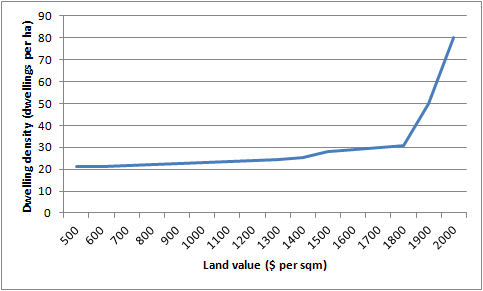
The end result of the above calculations is the classic density / land value gradient: urban density edges up as land values rise. As some point, density takes a sharp upward tack, once it becomes cheaper to build an apartment, compared to a town house.
Figure 2


In simple terms, you could say that there are three bands of density, set by land values and build costs. These are set out in Table 5. Should this be the rule of thumb to 'drive' zoning?
Table 5
Land Value per m2 (area median)
Development Type
Up to $1500 per m2
Two storey stand alone houses, town houses and infill type units
Between $1500 and $2000 per m2
Two or Three storey terrace or row houses on sites less than 200m2 per unit
Over $2,000 per m2
Four storey plus apartments