In theory, there should be a relationship between transport accessibility and urban form. As transport costs increase, cities tend to build up; as transport costs fall, cities tend to spread out. As cities get more densely developed, then high capacity public transport becomes more important in getting people around.
What about Auckland?

Starting with transport, if I plot distance from the CBD (as the crow flies) versus the percentage of bus, train, ferry, walk and cycle trips to work (in 2018) based on home residence, then I get the following graph.
This looks quite a good relationship: as distance from the central area increases, then the number of bus, train, ferry, walk and cycle (BTFWC) trips to work decrease. This data is based on census area units and 2018 census data.
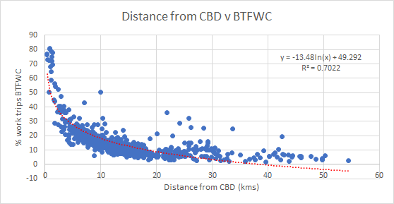
Using the formula provided by Excel, I get the following broad pattern.
Now lets look at housing density. The following graph plots gross dwelling density (again by Area Unit) by distance from CBD.
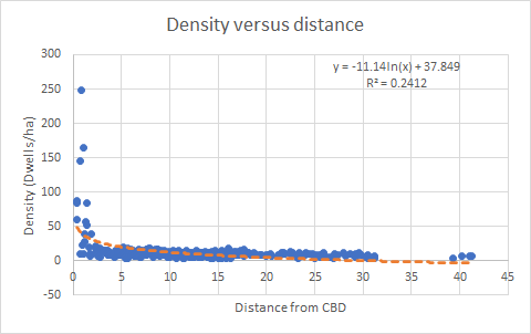
The dwelling density figure is a ‘gross’ figure - the land area of the Area Unit divided by the number of dwellings. A low gross density may therefore be because of a large park being present in the Area Unit, not because housing is spread out.
Again, based on the graph, I get the following broad pattern.
There is not necessarily a one to one relationship between the two sets of figures (journey to work and density) but the curves are not dissimilar.
Going from a dwelling density of 11 dwellings per ha to 20 dwellings per hectare will not automatically mean that public transport, walking and cycling will go from 18 to 27% of work trips, as proximity to the centre cleary has a big influence on both density and use of public transport, walking and cycling.
If we look at urban form, rather than density, then the percentage of dwellings that are in an attached form (rather than stand alone) should also increase as distance reduces (and public transport, walking and cycling increases).
The following graph plots the percentage of attached dwellings by Area Unit, based on distance from the centre.
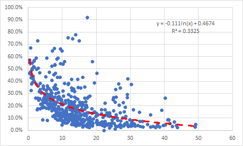
Bit more of a scattered picture than for dwelling density.
If we put the three sets of figures together then we get the following pattern:
So as we go from 15 to 10kms out from the CBD, the % of BTFWC trips to work increases by 1.43, housing density goes up 1.66 and percent attached dwellings go up by 1.27.
It would seem that the regional land use pattern is responding to transport costs and benefits. The question then becomes whether the observed step up in density and number of attached dwellings is responsive enough to the changed transport conditions. Should there be more , or less of a density step up?